What I built
Previously I built a twin by hand for one question: how long a stadium precinct takes to empty. It ended with a list of what it lacked: real demand instead of numbers I made up, real targets to check against, many runs instead of one, and a record of where every number came from. The Newcastle twin has each of these, for a whole city.

The city is Newcastle, in New South Wales, across its five council areas. It was chosen for a question: the city opened a 2.7 km light rail in 2019 whose business case, the state's Auditor-General found, was written after the decision to build it, and nobody has measured what it changed since. Answering that needs a model of how the whole city travels that can be trusted first, so the twin became the goal and the light rail its first question.
In one sentence: every resident of the study area has a synthetic counterpart with a home, a household, an age, a job or a school, a driver's licence or not, and a car or not; each of them has a day to get through; and each chooses how to travel it - drive, get a lift, walk, cycle, ride a motorbike, take a taxi, a bus, a train, the light rail or the ferry - on the real network, while trucks and freight trains take their real share of the roads and level crossings.
| The hand-built precinct twin | The Newcastle twin |
|---|---|
| Demand I wrote down: attendance × car share ÷ 2.5 | A population generated from the census, which chooses its own way to travel |
| One precinct's roads | The whole region: every road, footpath and cycle path, and every public transport timetable |
| Cars only | Twelve modes, each moving through the network |
| Nothing to check against | Twelve real ridership figures, checked every run |
The city, rebuilt from open data
Everything under the people is public data, rebuilt by scripts so that it can be rebuilt again. The roads, footpaths and cycle paths come from OpenStreetMap across four thousand square kilometres; the timetables from the transport department's open feeds for buses, trains, the light rail and the ferry.


The people are generated from the 2021 census, one census area (SA1) at a time, so that added up they match what was published there: household sizes, cars per household, age and sex, work and study, income. Driver licences come from the transport department's published counts, and each person's day is shaped by the state's travel survey: about three and a half trips, to real buildings. What nobody is given is a mode. They choose it in the simulation.

A day in the twin
The engine is MATSim. Every synthetic person carries a plan for the day and tries it on the network, where the plans meet in queues. Each plan is scored - time at work or at home is good, time stuck in traffic or waiting at a stop is bad, fares and parking cost money - and between rounds some people try something else: another route, another time, another mode. After a couple of hundred rounds the choices stop changing much, and the mode shares are read from that state.

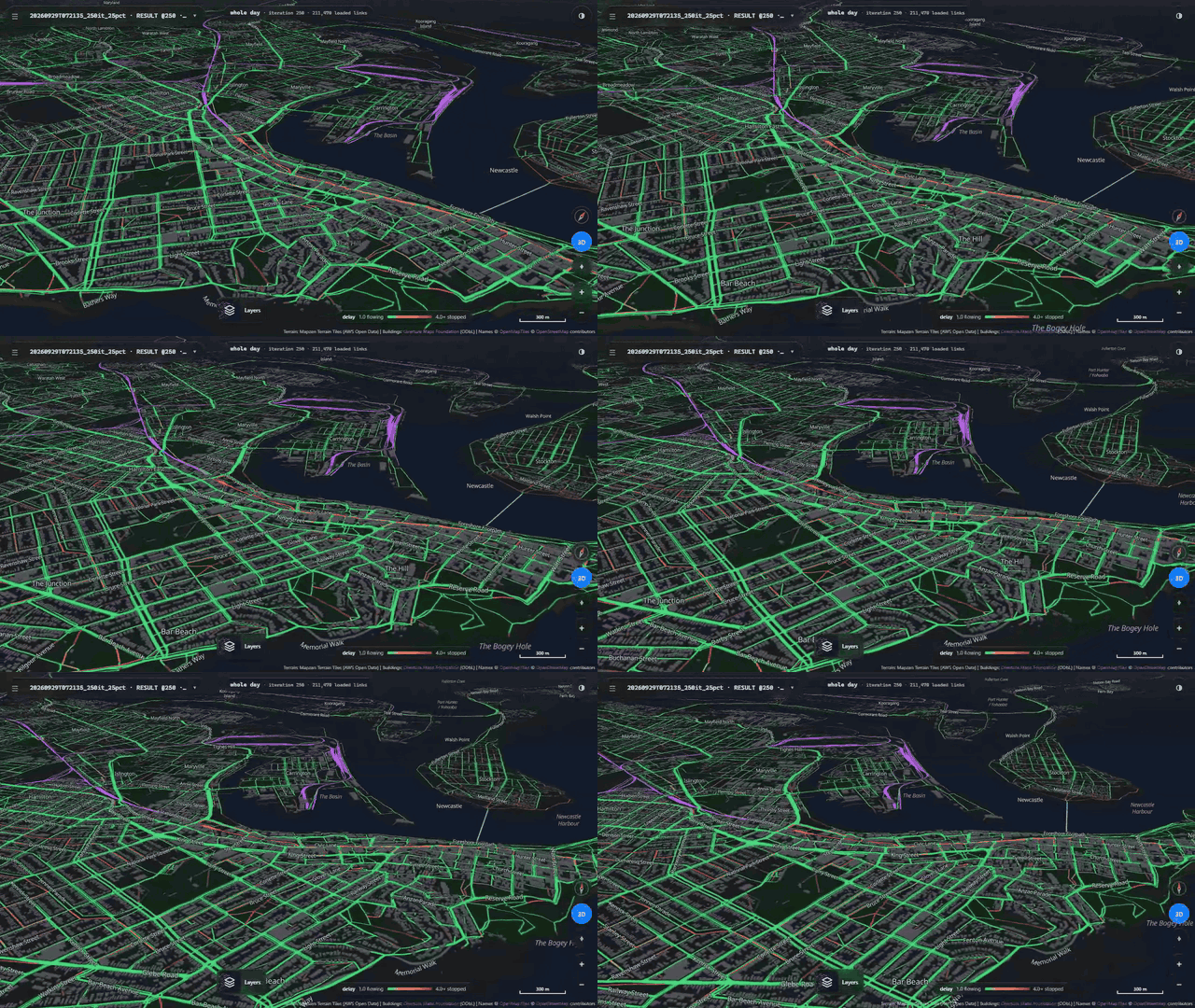
The twin has its own viewer. It opens any run, finished or still going, and draws the whole region: each street by how delayed it was, each rail, light rail and ferry line from the run's own timetable, and beside the map the twelve modes against their real targets.

How close to the real city
A twin is only worth what it can be checked against, so each of the twelve modes is scored on the basis its real figure is published on: the travel survey's shares of residents' trips, the Opal card's boardings at train stations, on the light rail and at the ferry wharves, and road counts for trucks. There is no single "public transport" row that could hide trains overshooting while trams undershoot.
Two of twelve modes are within 10% so far. Each mode has a constant that could be adjusted until it matches its target, but that would hide the missing behaviour rather than fix it, so the constants are left alone. The misses point at things the city does that the twin does not yet: people drive most trips under a kilometre, because the walk to a parked car costs them nothing yet; almost half of the attempts to plan a public transport journey find no route; and people without a car, with no lift and no bus, fall back on cycling and taxis far more than real people do. The light rail, the question the project started from, is still the furthest off.
What comes next
The next steps are the missing behaviours the scoreboard points to, then the question the twin was built for: Newcastle with its light rail, and without it. The next post opens the twin up stage by stage: the network, the timetables, the population and their days, the simulation, how each run is checked, and what it takes to run one.
Sources & anchors
- The twin's repository, public - github.com/praneetdhoolia/city-digital-twin · its goal - docs/GOAL.md · its status board - docs/STATUS.md · its project reports - praneetdhoolia.github.io/city-digital-twin
- Figures 1, 7 and 8: the twin's run viewer on run
20260929T072135_250it_25pct· figures 2 to 4 and 6: drawn from the same run's network, timetables, persons and trips · map data © OpenStreetMap contributors (ODbL), buildings from Overture Maps - MATSim - matsim.org · Horni, Nagel & Axhausen (eds.), The Multi-Agent Transport Simulation MATSim, Ubiquity Press (2016) - doi.org/10.5334/baw · pt2matsim - github.com/matsim-org/pt2matsim
- The origin question, the Newcastle light rail - newcastle-lr-proposal.md · the population and demand - population-and-demand.md · ABS Census DataPacks - abs.gov.au
- The network, timetables and signals - network-and-inputs.md · signals-and-crossings.md · the targets and the scoreboard - public-transport-and-yardsticks.md